
NORA EN PURE
EVENT ART
Nora En Pure is one of the world's leading melodic and deep house artists and the founder of Purified Records, a record label and global event series known for blending electronic music with nature-inspired visual storytelling. Each Purified event takes place in a different city, accompanied by artwork that reflects both the destination and the label's distinctive identity.
CHALLENGE: To create a scalable visual concept capable of adapting to Purified events around the world while remaining instantly recognizable. Every artwork needed to celebrate the unique character of its location without losing the visual consistency audiences associate with the Purified brand.
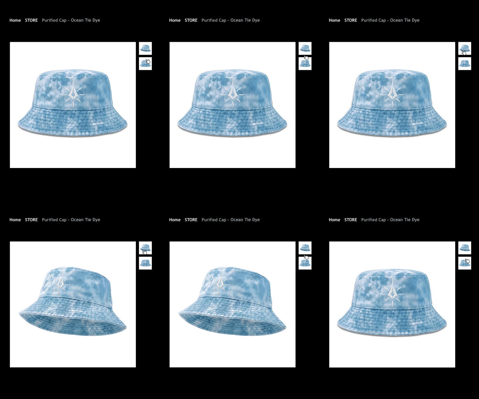
ABOUT: DEPULP developed a series of photorealistic artworks built around Purified's iconic symbol, transforming the logo into a physical, natural object that exists within each landscape.
Rather than placing a graphic mark over a destination, the identity becomes part of the environment itself. The logo was reimagined using realistic rock, ice and organic textures, allowing it to naturally integrate into coastlines, mountains, forests and urban environments while maintaining its instantly recognizable silhouette.
Each composition was carefully crafted to capture the atmosphere of the host location, creating a unique visual identity for every event while preserving a consistent artistic language across the entire Purified series. Final event information and promotional copy were later integrated by the Purified team for each individual release.



NORA EN PURE
EVENT ART
Nora En Pure is one of the world's leading melodic and deep house artists and the founder of Purified Records, a record label and global event series known for blending electronic music with nature-inspired visual storytelling. Each Purified event takes place in a different city, accompanied by artwork that reflects both the destination and the label's distinctive identity.
CHALLENGE: To create a scalable visual concept capable of adapting to Purified events around the world while remaining instantly recognizable. Every artwork needed to celebrate the unique character of its location without losing the visual consistency audiences associate with the Purified brand.
ABOUT: DEPULP developed a series of photorealistic artworks built around Purified's iconic symbol, transforming the logo into a physical, natural object that exists within each landscape.
Rather than placing a graphic mark over a destination, the identity becomes part of the environment itself. The logo was reimagined using realistic rock, ice and organic textures, allowing it to naturally integrate into coastlines, mountains, forests and urban environments while maintaining its instantly recognizable silhouette.
Each composition was carefully crafted to capture the atmosphere of the host location, creating a unique visual identity for every event while preserving a consistent artistic language across the entire Purified series. Final event information and promotional copy were later integrated by the Purified team for each individual release.


"I've worked with Owen on transforming our digital presence, and he was essential to our growth. He has this ability to understand business challenges, not just make things look pretty. Owen built custom solutions that streamlined our processes and made our team more efficient. Working with him was seamless and professional."
Client name
Client role
NORA EN PURE
EVENT ART
Nora En Pure is one of the world's leading melodic and deep house artists and the founder of Purified Records, a record label and global event series known for blending electronic music with nature-inspired visual storytelling. Each Purified event takes place in a different city, accompanied by artwork that reflects both the destination and the label's distinctive identity.
CHALLENGE: To create a scalable visual concept capable of adapting to Purified events around the world while remaining instantly recognizable. Every artwork needed to celebrate the unique character of its location without losing the visual consistency audiences associate with the Purified brand.
ABOUT: DEPULP developed a series of photorealistic artworks built around Purified's iconic symbol, transforming the logo into a physical, natural object that exists within each landscape.
Rather than placing a graphic mark over a destination, the identity becomes part of the environment itself. The logo was reimagined using realistic rock, ice and organic textures, allowing it to naturally integrate into coastlines, mountains, forests and urban environments while maintaining its instantly recognizable silhouette.
Each composition was carefully crafted to capture the atmosphere of the host location, creating a unique visual identity for every event while preserving a consistent artistic language across the entire Purified series. Final event information and promotional copy were later integrated by the Purified team for each individual release.