ARHIDEJA
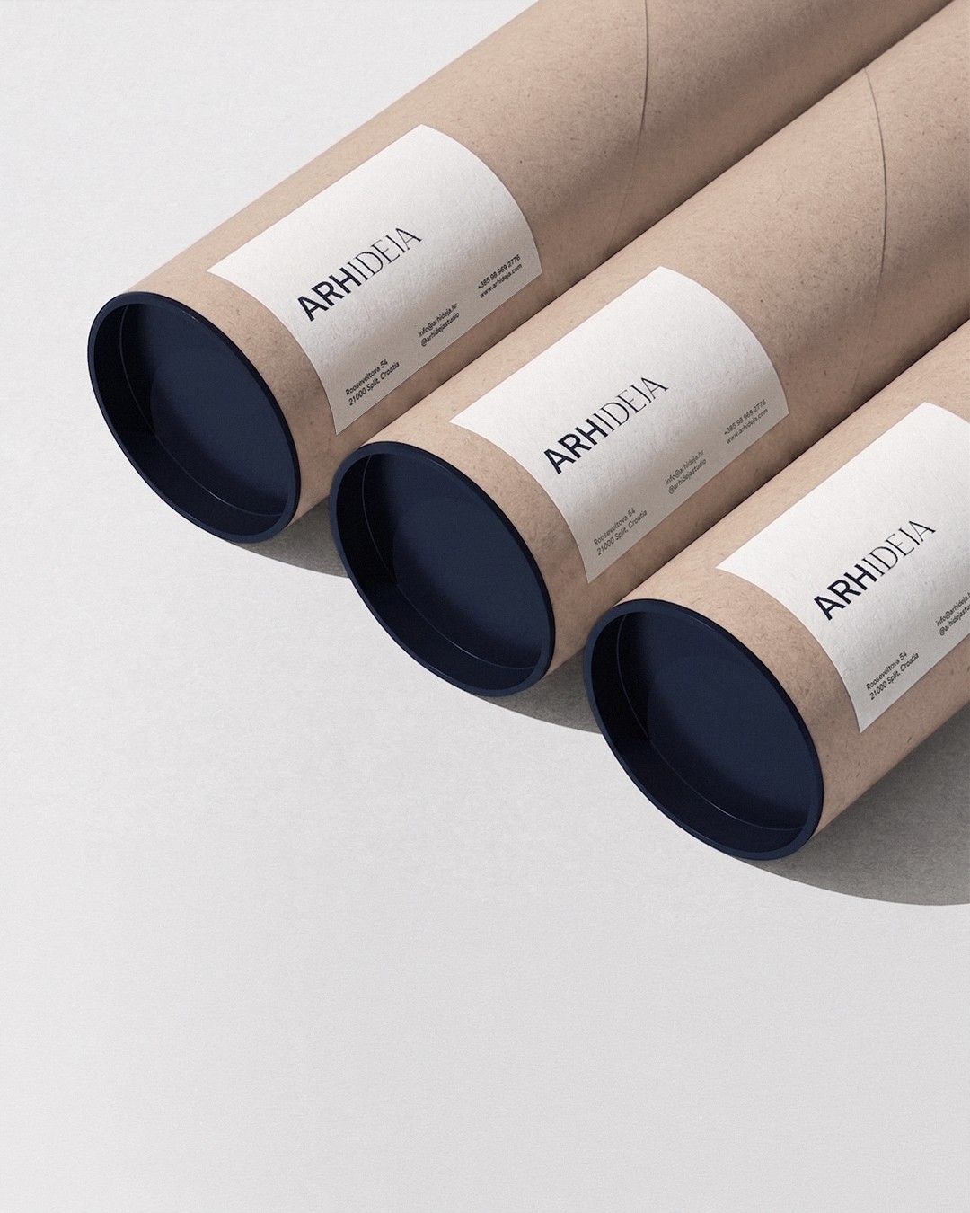
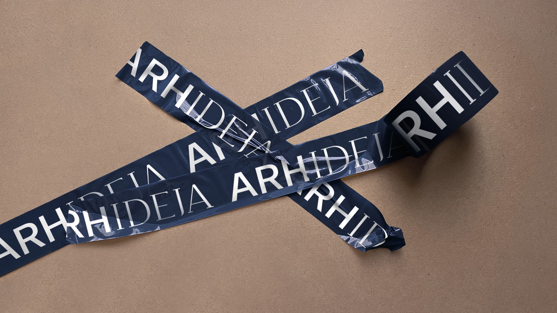
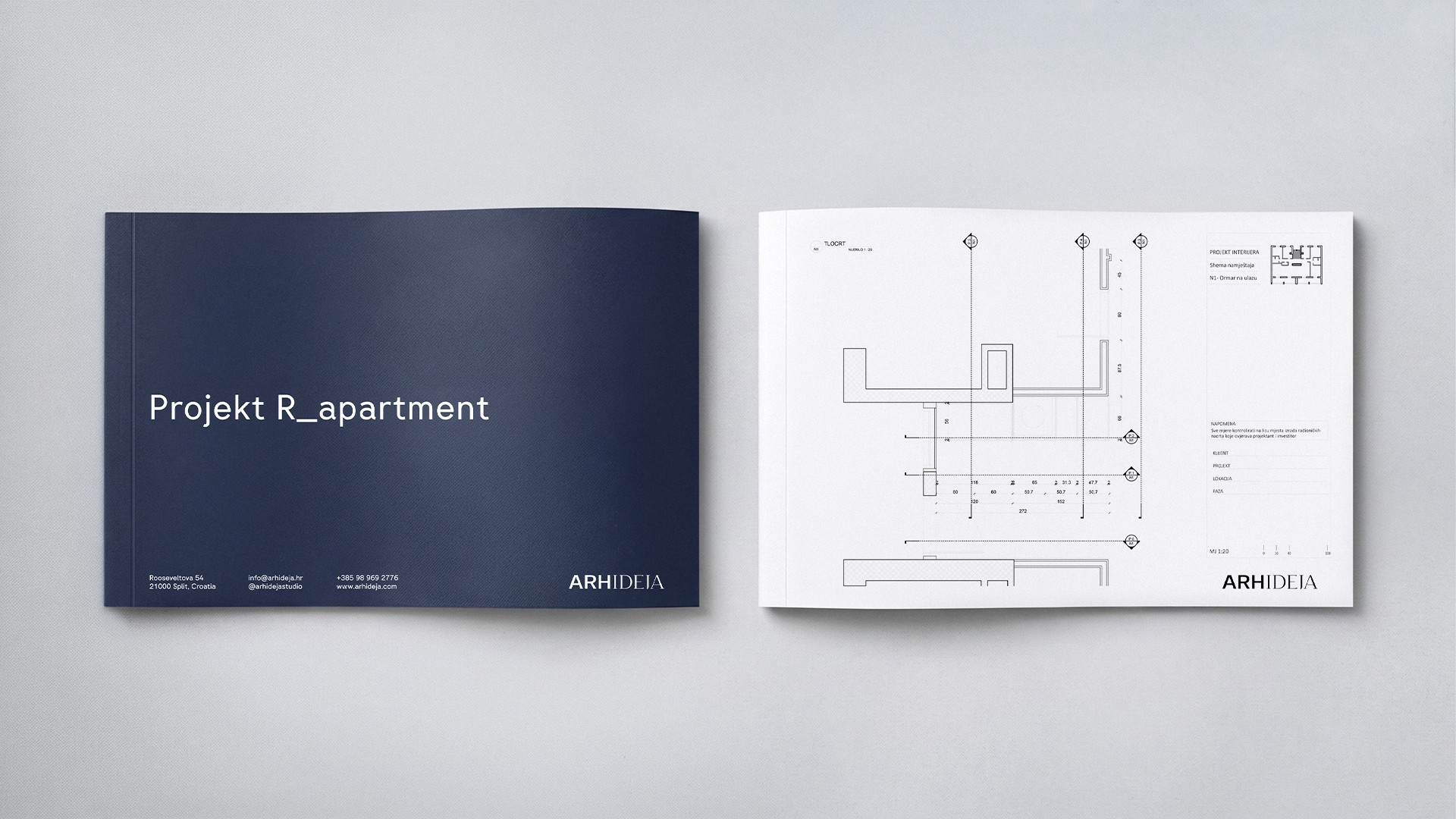
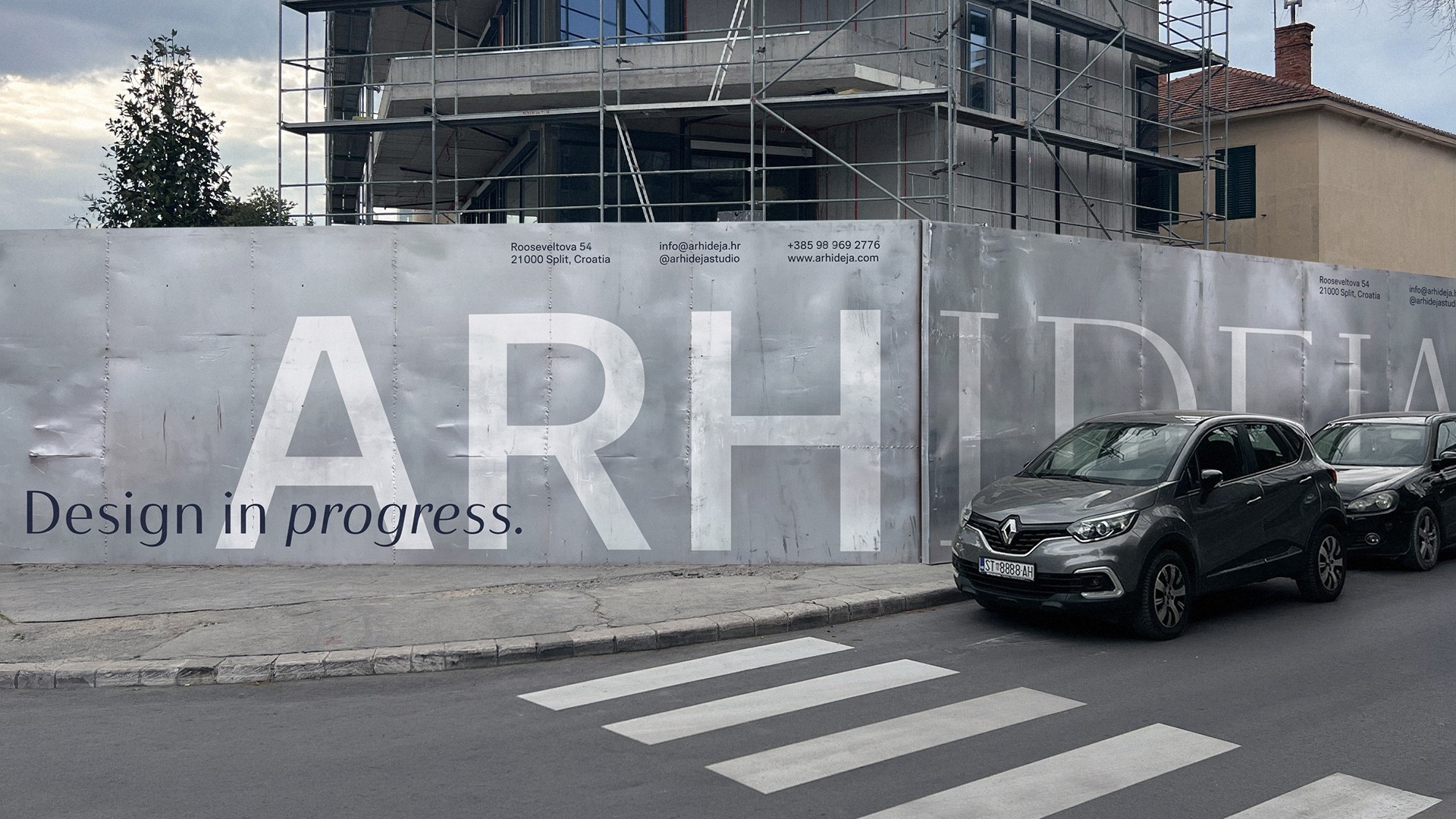
Brand Strategy ∙ Visual Identity ∙ Brand Guidelines ∙ Website ∙ Social Media Identity ∙ Stationery ∙ Presentation System ∙ Brand Applications
Founded in 1994, Arhideja is an architecture and interior design studio based in Split, Croatia. For more than three decades, the studio has been designing residential, commercial and hospitality spaces, guiding clients through every stage of the process: from the first sketch to the final detail. Built on experience, precision and timeless design, Arhideja continues to redefine spaces with the same passion that shaped its foundation.
AIM: To reposition a studio with over 30 years of expertise through a visual identity that reflects its level of craftsmanship today. The challenge was to preserve Arhideja's heritage while creating a contemporary brand capable of communicating authority and longevity across every client touchpoint.
Concept: Architecture is built on balance. Between creativity and precision. Between tradition and innovation. Between bold ideas and meticulous execution.
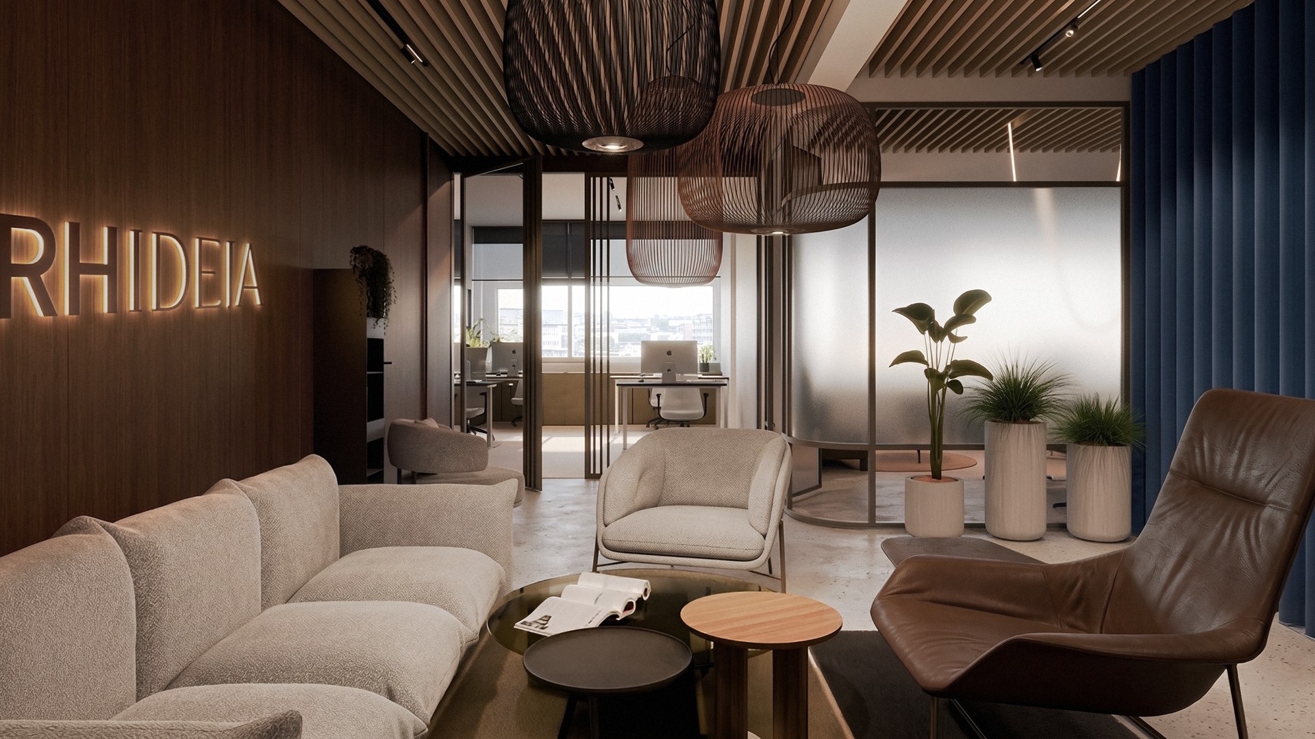
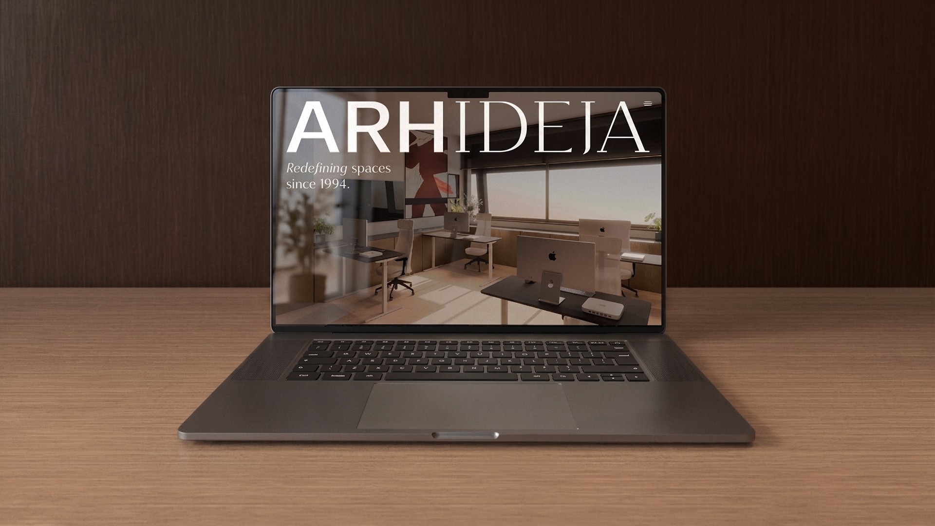
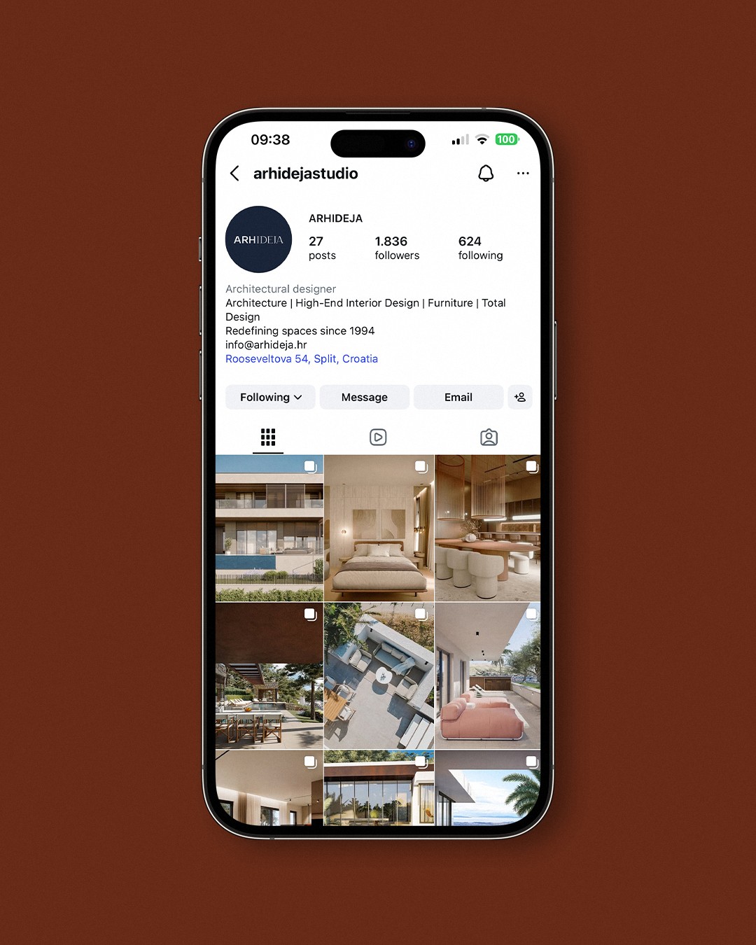
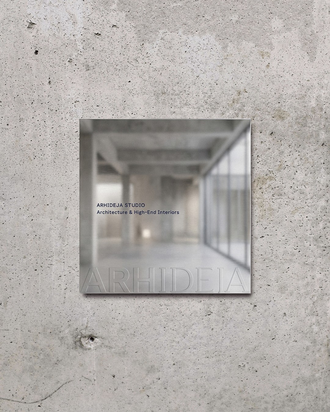
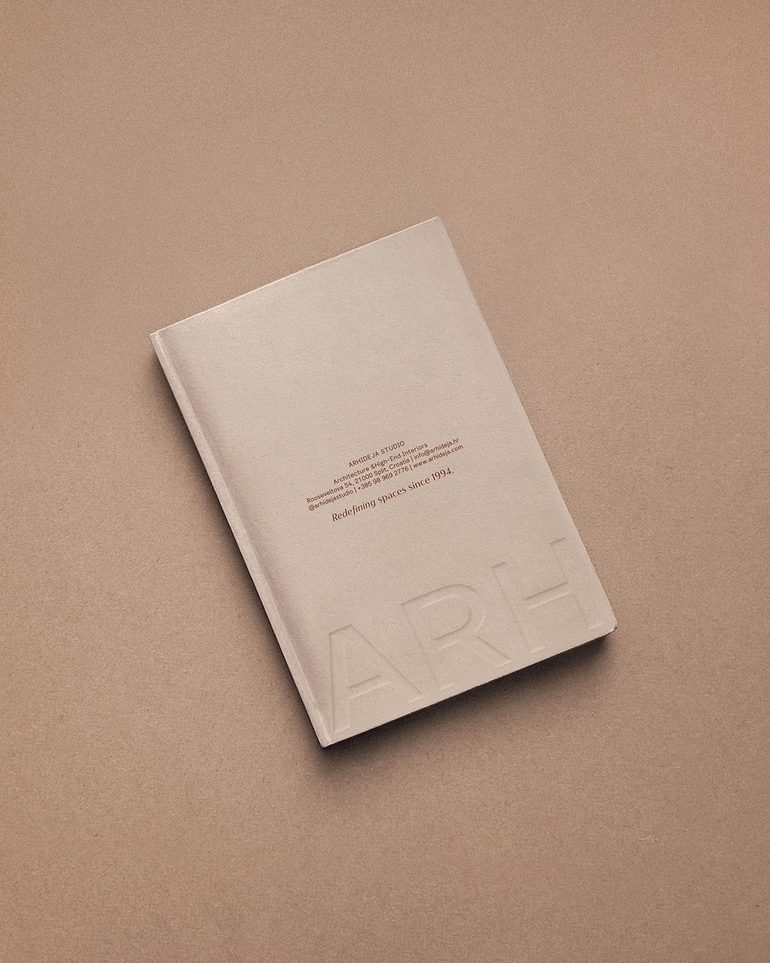
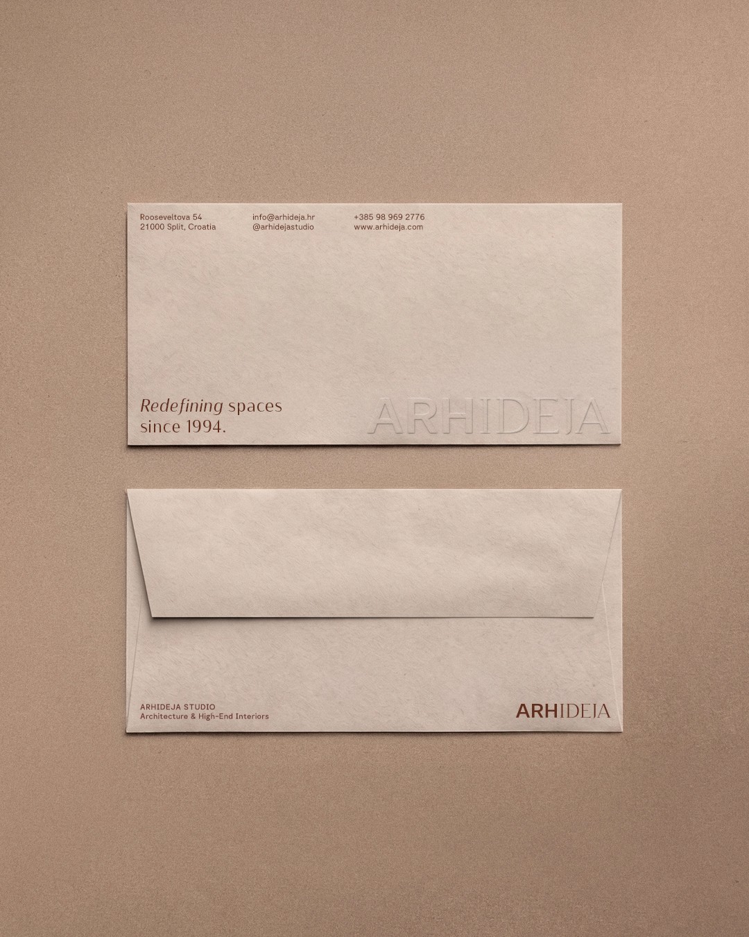
The new identity follows the same philosophy. Inspired by Arhideja's architectural approach, every element was designed to feel structured, restrained and timeless. Rather than following trends, the identity focuses on longevity allowing the work itself to remain the centre of attention.






ARHIDEJA
Brand Strategy ∙ Visual Identity ∙ Brand Guidelines ∙ Website ∙ Social Media Identity ∙ Stationery ∙ Presentation System ∙ Brand Applications
Founded in 1994, Arhideja is an architecture and interior design studio based in Split, Croatia. For more than three decades, the studio has been designing residential, commercial and hospitality spaces, guiding clients through every stage of the process: from the first sketch to the final detail. Built on experience, precision and timeless design, Arhideja continues to redefine spaces with the same passion that shaped its foundation.
AIM: To reposition a studio with over 30 years of expertise through a visual identity that reflects its level of craftsmanship today. The challenge was to preserve Arhideja's heritage while creating a contemporary brand capable of communicating authority and longevity across every client touchpoint.
Concept: Architecture is built on balance. Between creativity and precision. Between tradition and innovation. Between bold ideas and meticulous execution.
The new identity follows the same philosophy. Inspired by Arhideja's architectural approach, every element was designed to feel structured, restrained and timeless. Rather than following trends, the identity focuses on longevity allowing the work itself to remain the centre of attention.
"I've worked with Owen on transforming our digital presence, and he was essential to our growth. He has this ability to understand business challenges, not just make things look pretty. Owen built custom solutions that streamlined our processes and made our team more efficient. Working with him was seamless and professional."

Client name
Client role
ARHIDEJA
Brand Strategy ∙ Visual Identity ∙ Brand Guidelines ∙ Website ∙ Social Media Identity ∙ Stationery ∙ Presentation System ∙ Brand Applications
Founded in 1994, Arhideja is an architecture and interior design studio based in Split, Croatia. For more than three decades, the studio has been designing residential, commercial and hospitality spaces, guiding clients through every stage of the process: from the first sketch to the final detail. Built on experience, precision and timeless design, Arhideja continues to redefine spaces with the same passion that shaped its foundation.
AIM: To reposition a studio with over 30 years of expertise through a visual identity that reflects its level of craftsmanship today. The challenge was to preserve Arhideja's heritage while creating a contemporary brand capable of communicating authority and longevity across every client touchpoint.
Concept: Architecture is built on balance. Between creativity and precision. Between tradition and innovation. Between bold ideas and meticulous execution.
The new identity follows the same philosophy. Inspired by Arhideja's architectural approach, every element was designed to feel structured, restrained and timeless. Rather than following trends, the identity focuses on longevity allowing the work itself to remain the centre of attention.